Neon, integration, deconstruction or original font? What makes a business face successful in 2018?
In general, a lot of well-known designers outline a number of design trends for 2018, but we will base this selection on 15 trends in graphic design for 2018, which were featured by Philippe Van Dusen, founder of Verhaal Brand Design, a New York Strategic Design and Branding Studio.
Text as a complete design element
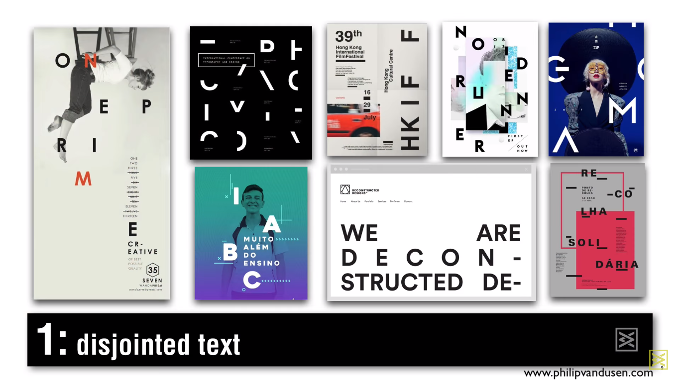
Broken text
The broken text is an interesting visual typography. The designer creates a kind of abstract form, separating letters or phrases. The idea is to integrate messages and content into a design, but still keep the design more visible than readable. This way, this trend is great for those customers who want to combine design text and, at the same time, keep the design illustrative and add variety to it.
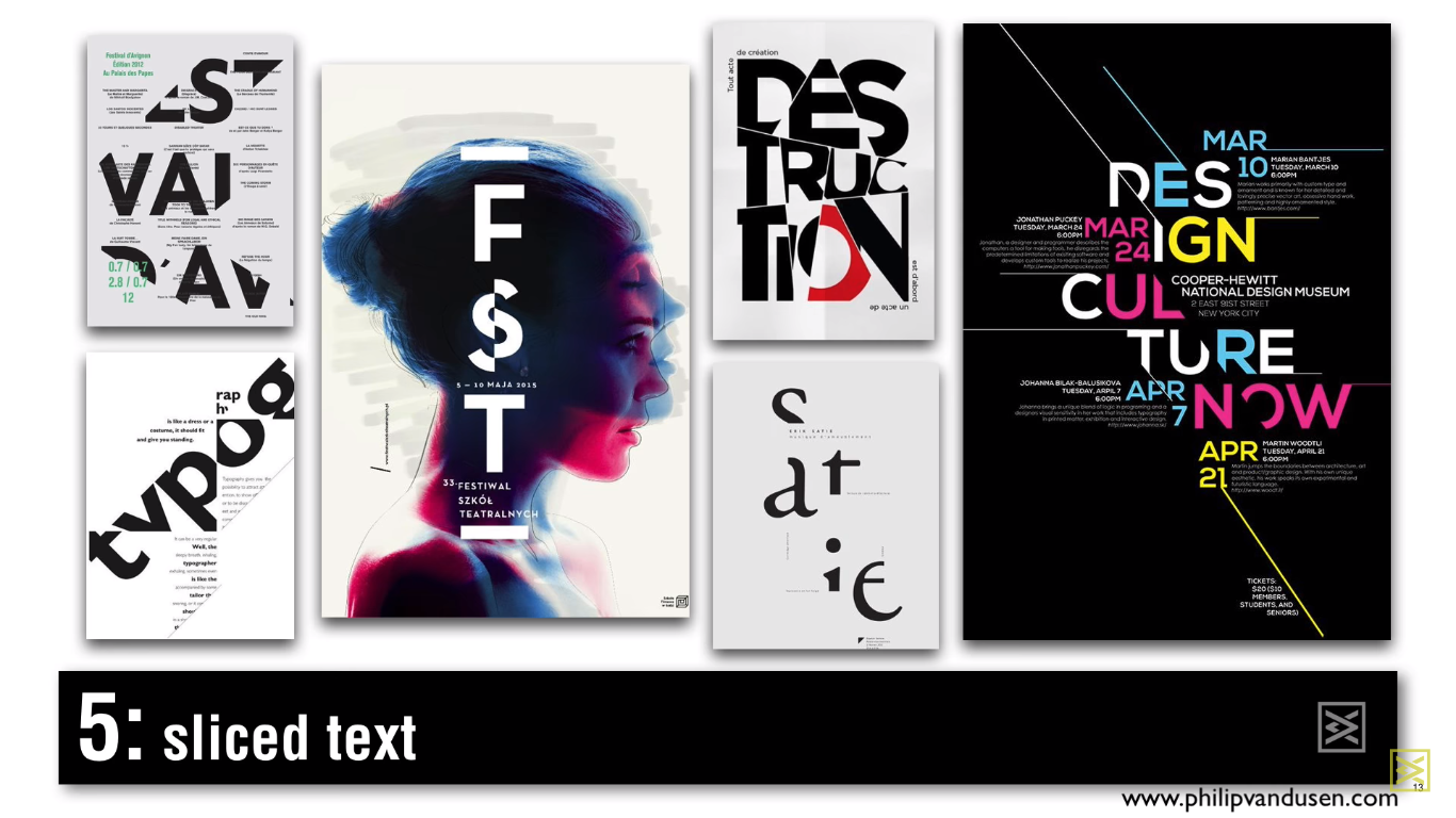
Cut text
The cut text is somewhat similar to the broken text. Its feature is that the word or phrase is “cut” and has a collage effect, while the broken text is faster characterized by spreading the text throughout the design.
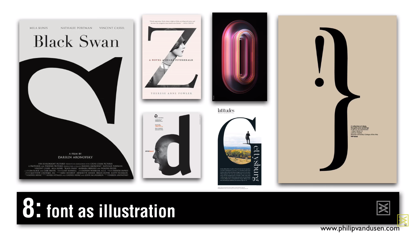
Font as illustration
Using the font, letter shape or numeric form as an element for illustration, and you can either insert an image into a letter, or beat it with it. The form of the letter or number can also be used to specify the theme of the composition.
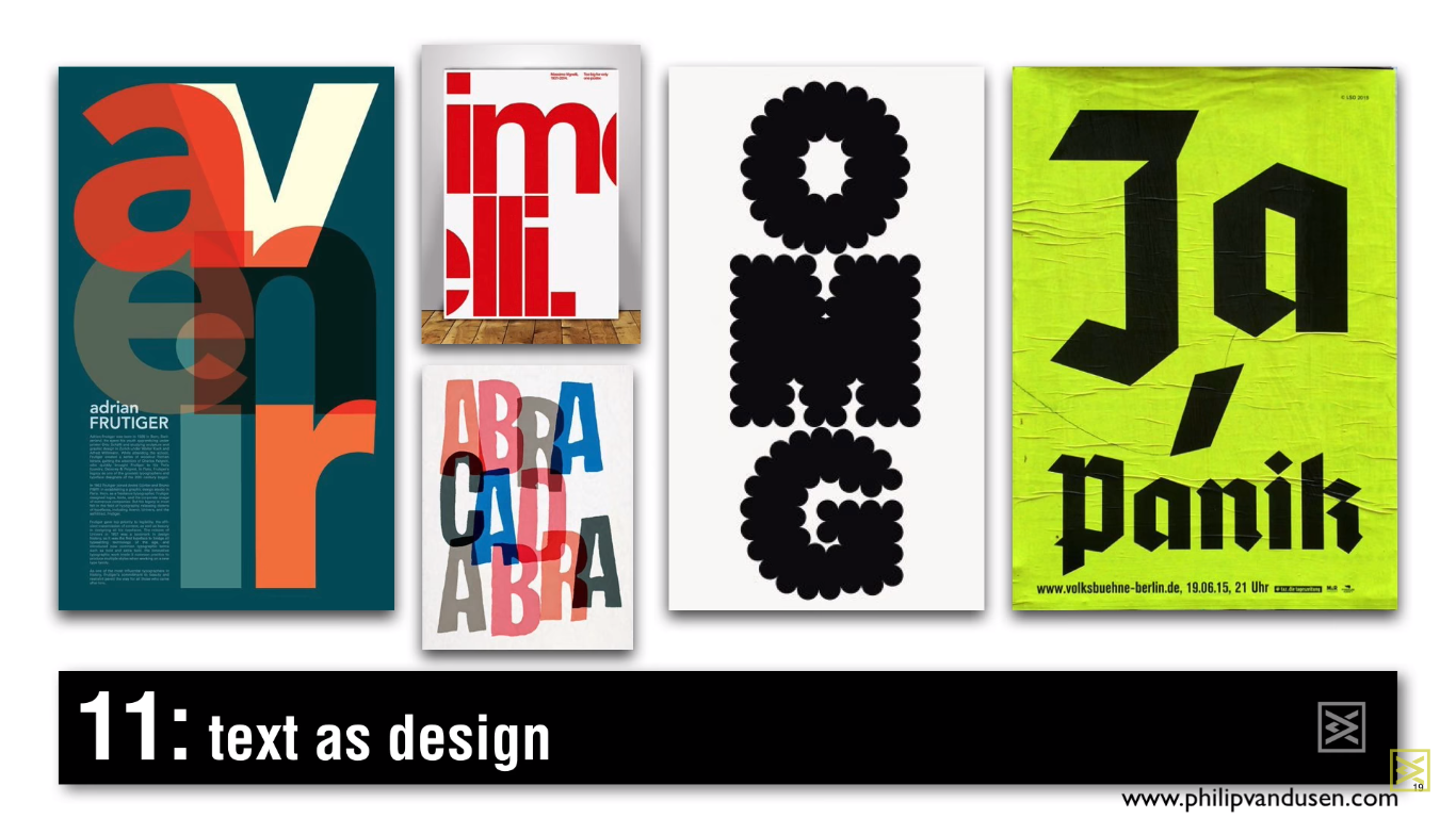
Text as a design
This tendency is distinguished among other things by the fact that the central element of the composition is the text itself. This trend is similar to the previous, but it does not use any pictures or illustrations in the design, except the letter form. Here you can use different font combinations, different scaling, overlaying or cropping to give the design an interesting visual effect.
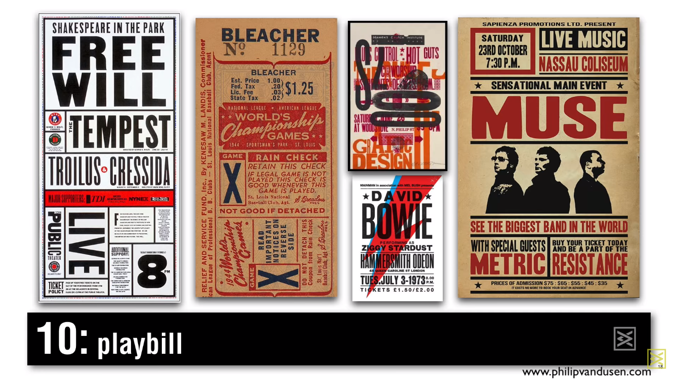
Poster
This trend makes reference to old combat or musical posters of the 20’s and 30’s, or even the 70’s and 80’s, but rather differs from other text trends by the fact that texts of different forms are superimposed on it and placed in different directions.
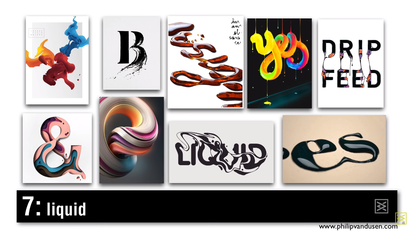
Liquid
This technology can be used both in 3D and in 2D, combining font with the appearance of a spill liquid: from ink to paint.
Color
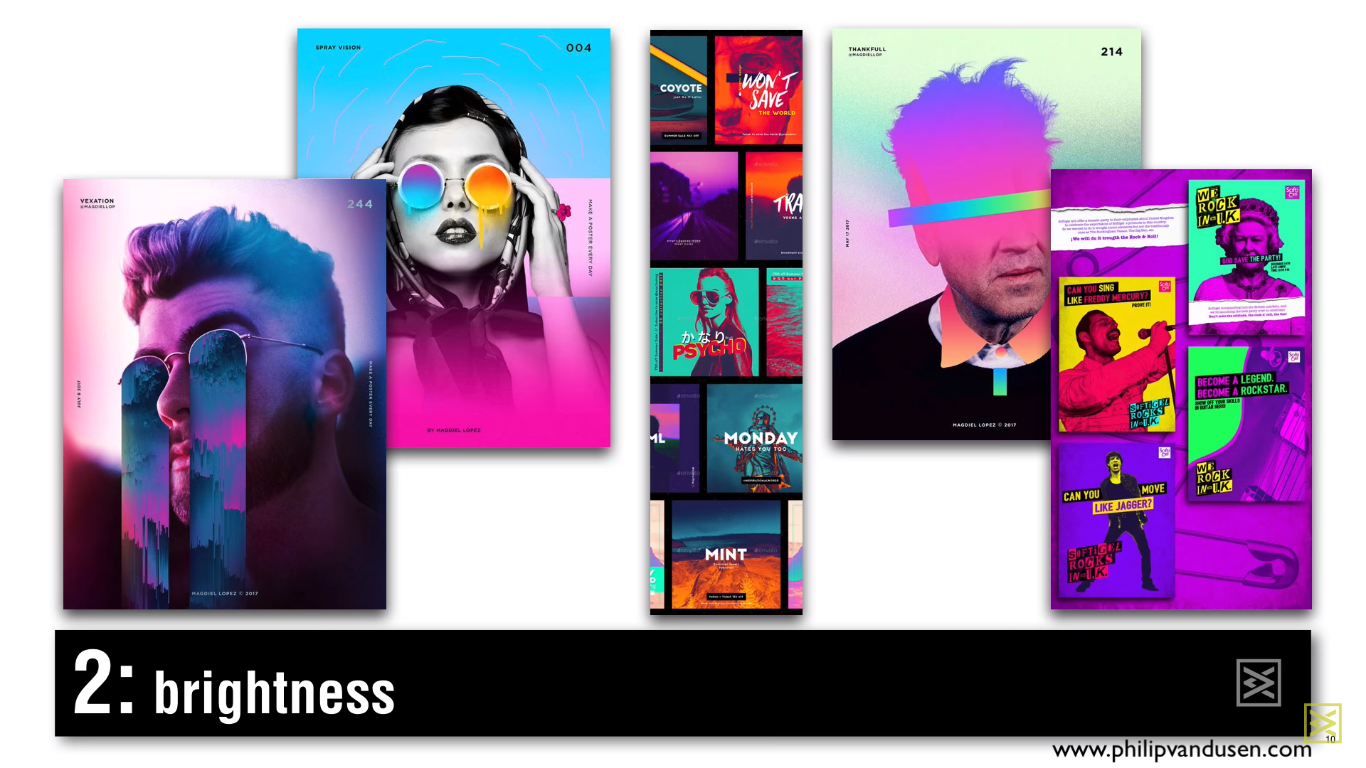
Brightness
This trend is characterized by the use of bright, neon colors, or in general the combination of opposite colors: violet and yellow, blue and orange, etc.
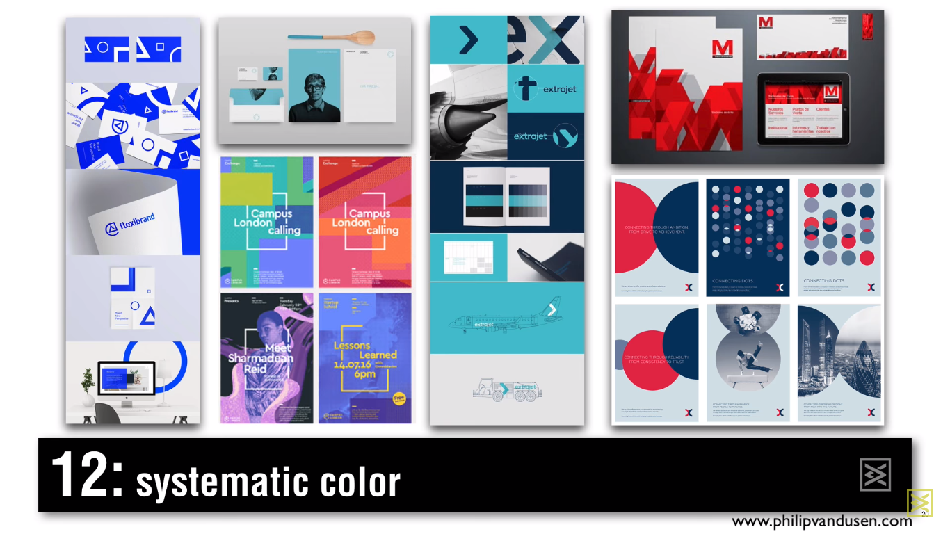
System color
When you make a logo and a brand identification system, you usually develop it in the entire palette to make it look like a holistic system. The system color uses a tight color palette, which creates a very systematic visual image for your brand.
Transparency
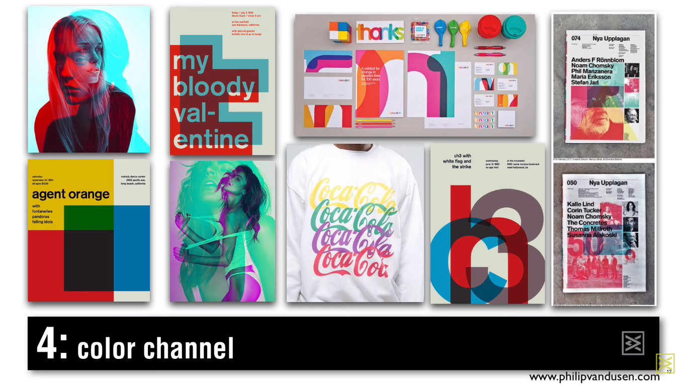
Color channel
In order for an image or text to match this trend, all CMYK or RGB colors must be broken and overlayed at different levels of transparency. Here you use transparent color as a design element.
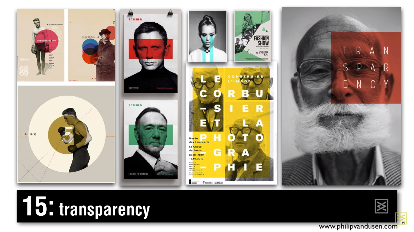
Transparency
Transparency is slightly similar to the color channel, but in this case, the colors, cut by geometric shapes, are usually overlapped on black and white photographs to create a sharp contrast between color and photography. These elements can also highlight certain areas of the composition and create a visual hierarchy.
Deconstruction
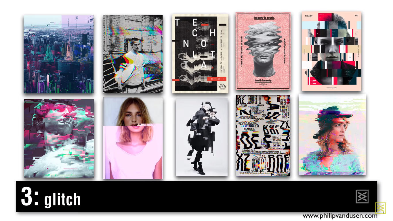
Glitch
The design trend is very popular this year. A glitch is a peculiar imperfect image that is damaged by deconstruction and glitches, which looks like it destroys certain digital impediments.
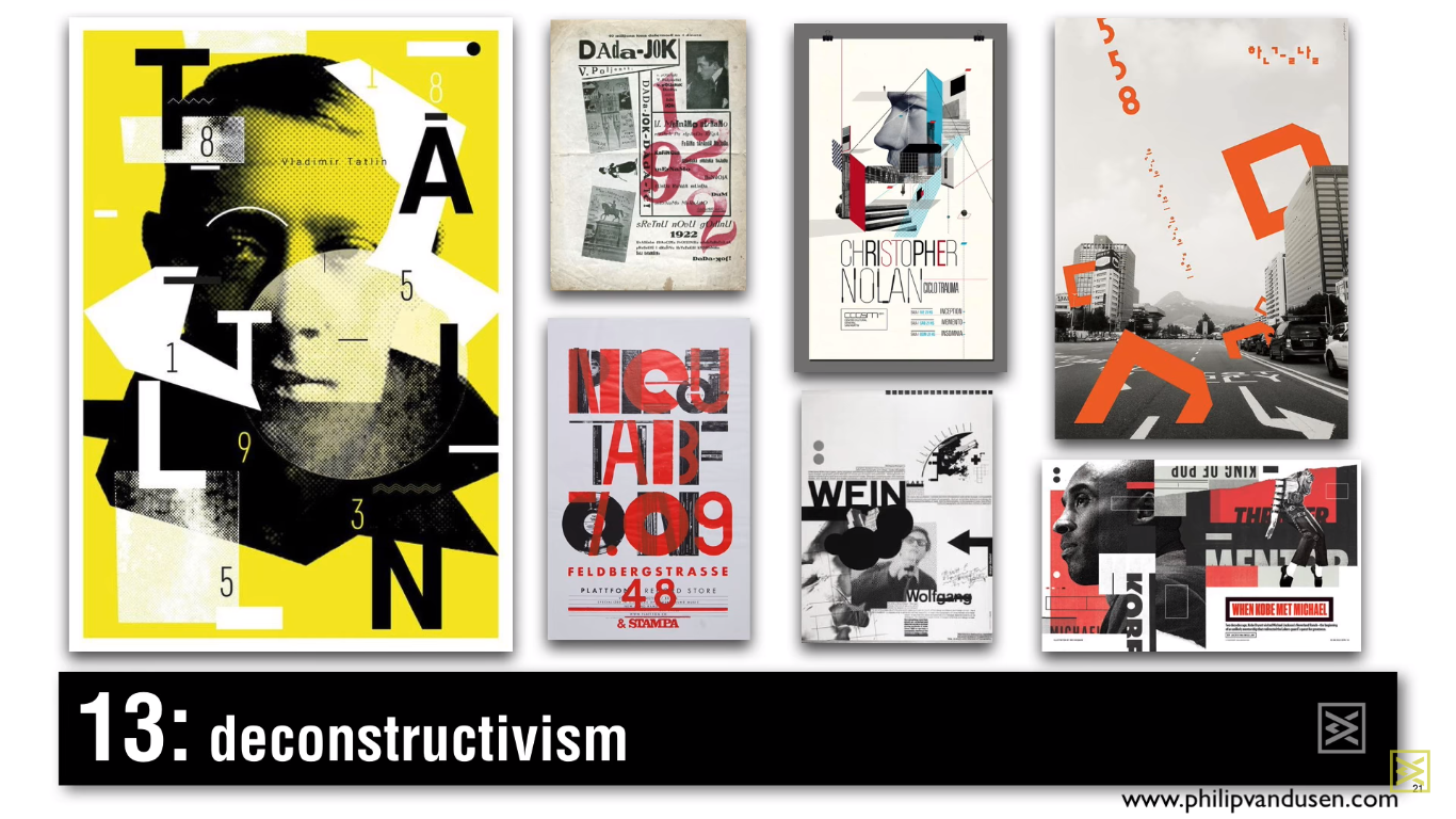
Deconstructivism
The use of strict monochromatic designs containing a black and white photograph and vivid colors, broken leaf shapes, cut design elements, chopped spatial elements in a very collage – that’s how this tendency characterizes. It is characterized by the lack of harmony, systematicity and symmetry. The finished appearance is characterized by unpredictability and controlled chaos.
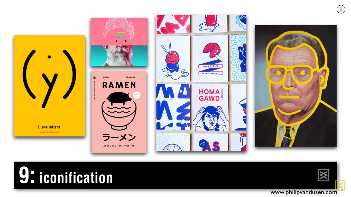
Iconography
Iconography is a photo, illustration or image that is reduced to a simpler linear form and, to a certain extent, creates simplified images from it. They can be created using depth, gradient and handwritten elements.
Integration
Integration
Integration is a very popular trend when you take fonts, letters, or numbers, and integrate them into a photo. It’s as if the text and photo live in the same physical space. You can always find a visually interesting way to interweave one another.
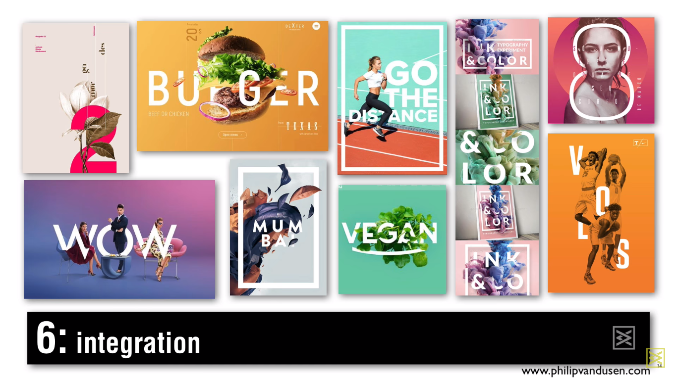
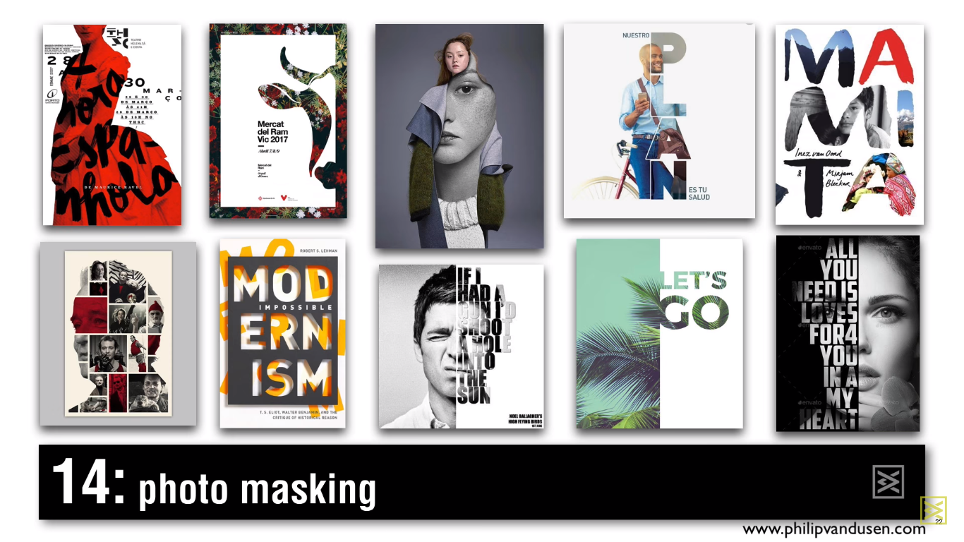
Photo masking
The masking of photos is similar to integration, but differs in that you use text items, color bars to mask your photos. You can also use shapes to mask a photo in another photo.