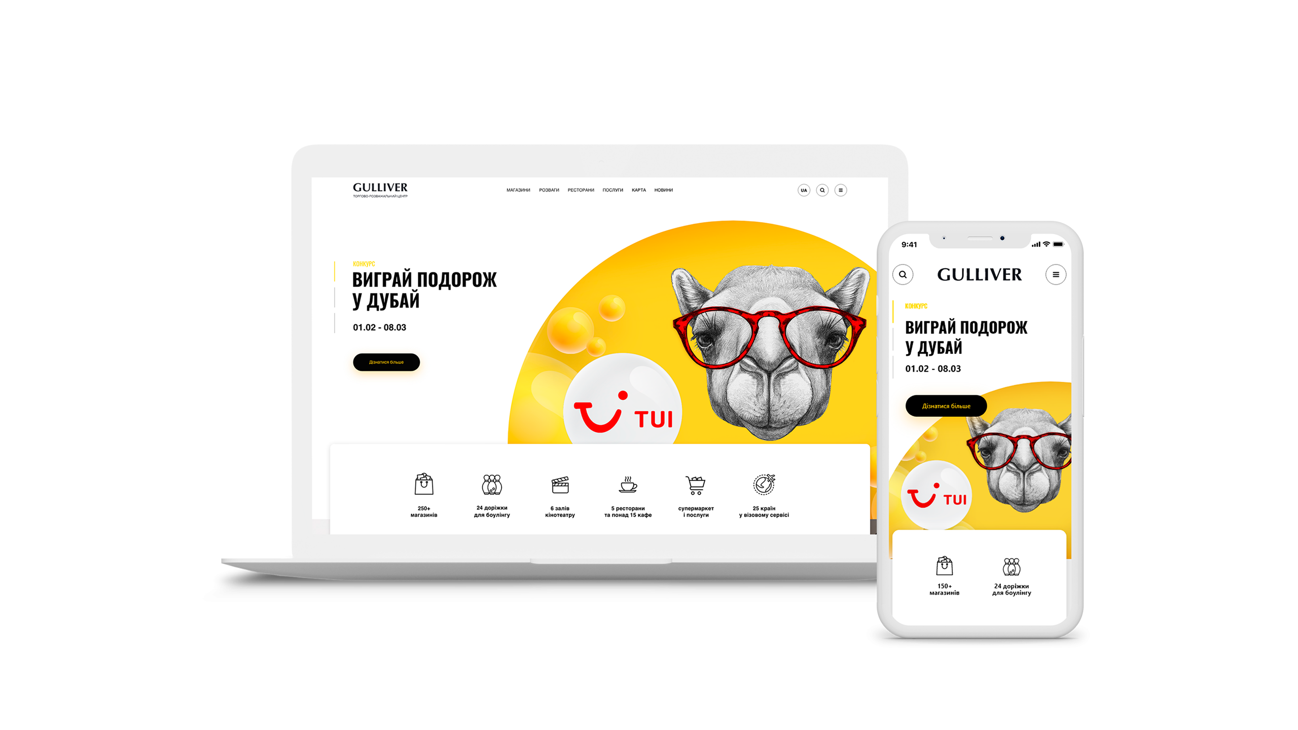
Project:
In addition to the client brief, the modern world also dictates its rules to us! And the main rule of today is that if a user came to your site and did not find what they were looking for within 5 seconds, you lost it. We could not allow this to happen to our IFC Gulliver client. Therefore, simplicity of usability and speed of access to information have become top priorities in the work.
Company:
IFC Gulliver consists of two towers of business and shopping centers. Moreover 97% of traffic is generated by visitors to the mall. Namely: buzzers who hang out at the mall, people who come for shopping, white collar workers from coworking, and other BC units. At the same time, the directly profitable audience is a small but very important percentage of traffic – tenants of retail space and offices.
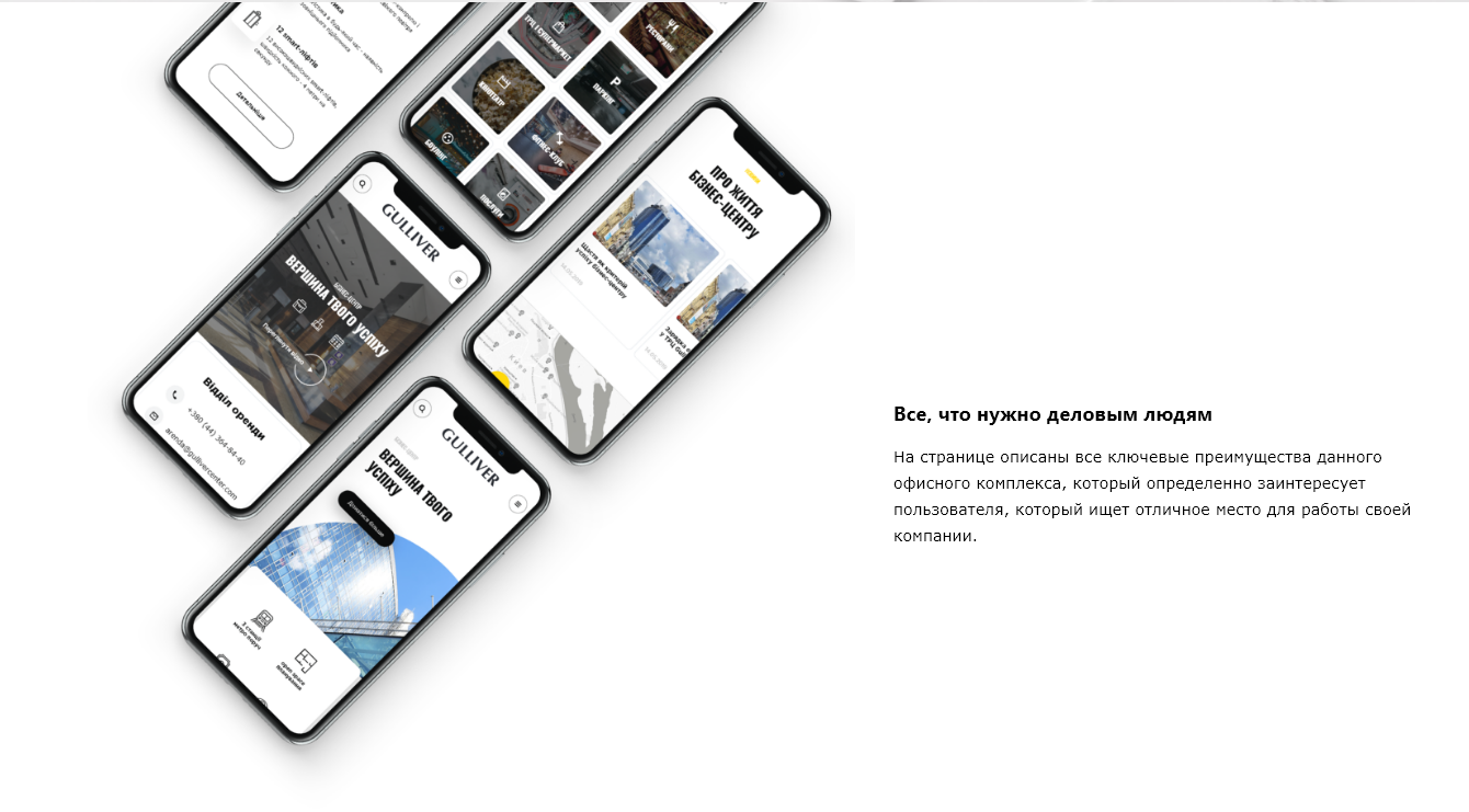
More than 70% of all traffic is mobile device visits.
Main task:
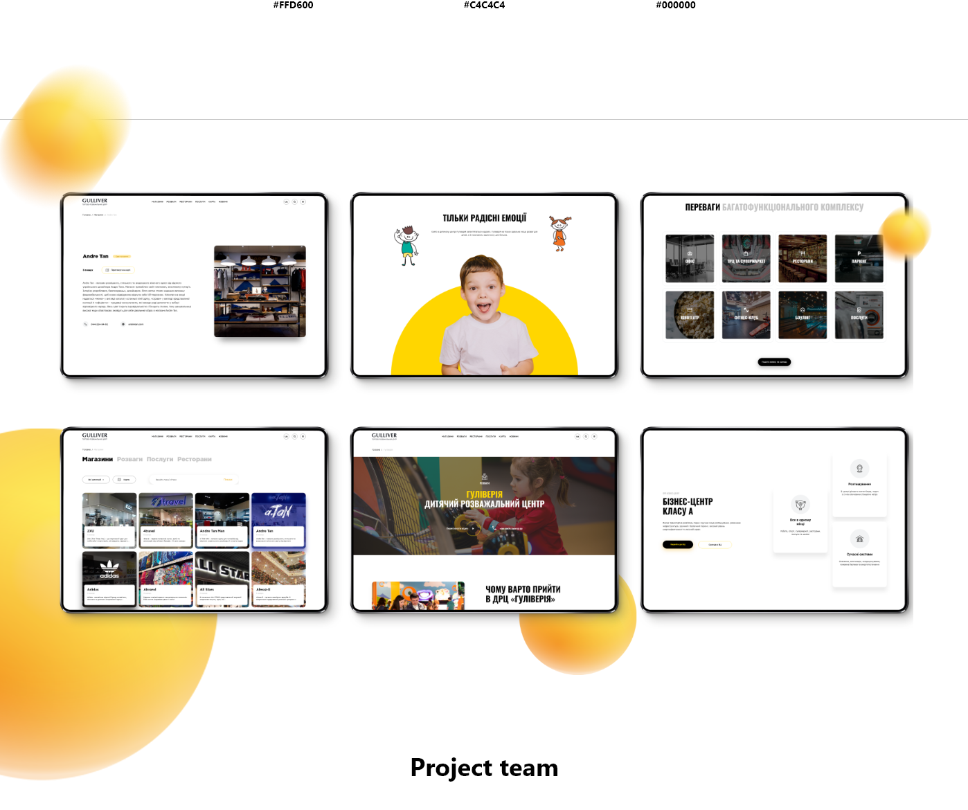
Not to divide and conquer, but to unite and direct. Namely – to make a simple and recognizable site (design and front-end) for the user. Shorten the path of people who want to spend money to the information they need. One site for all IFC.
Decision:
Stage 1 “soil tillage”:
– collection of business requirements from stakeholders (customer representatives);
– interviews and interviews with the guests of the mall;
– Analytics data analysis.
Stage 2 “Data Analysis”.
Stage 3: Direct Site Creation:
Design
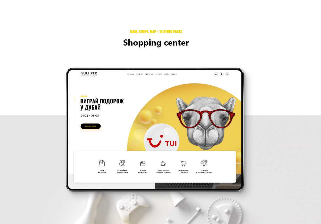
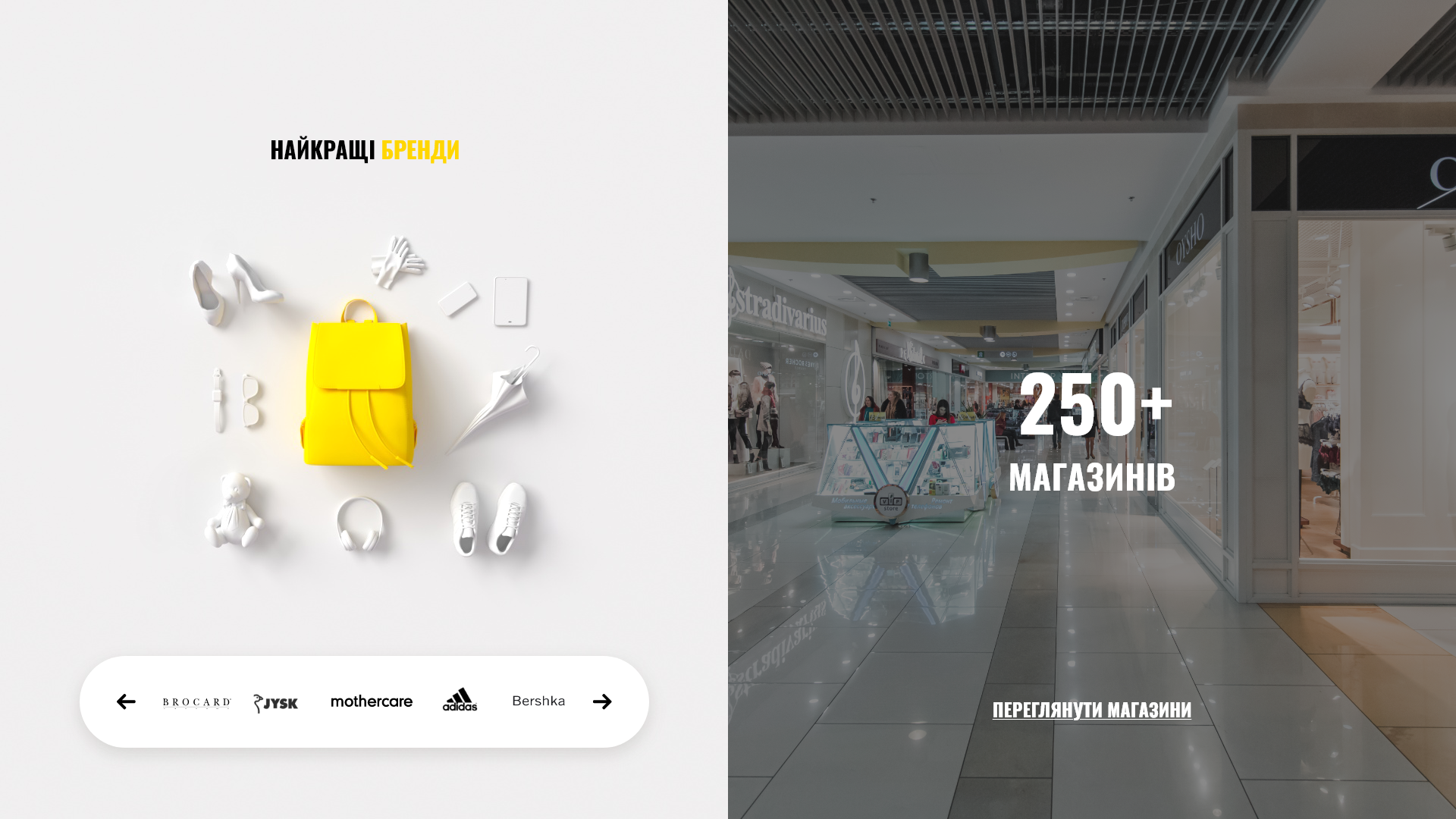
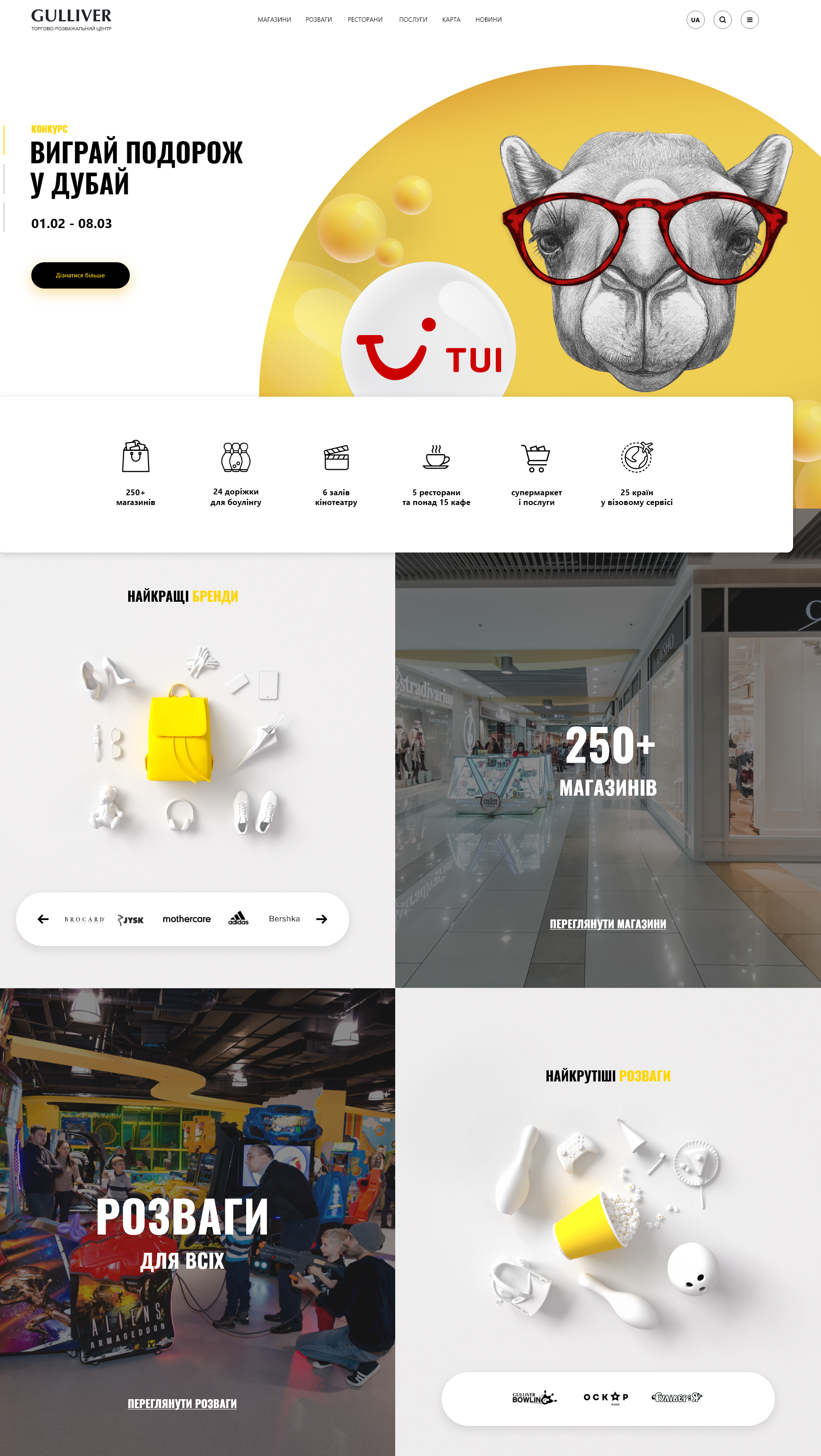
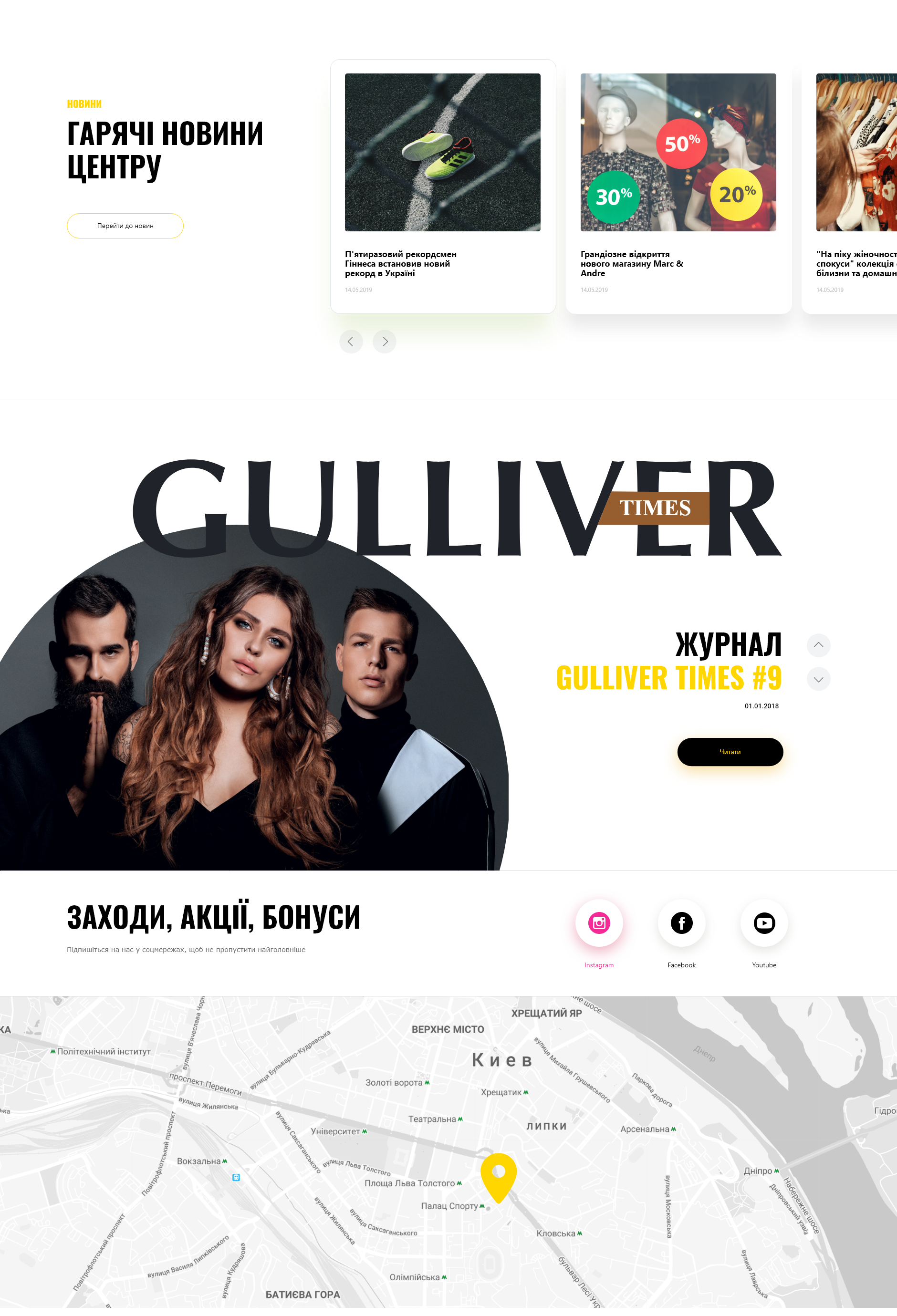
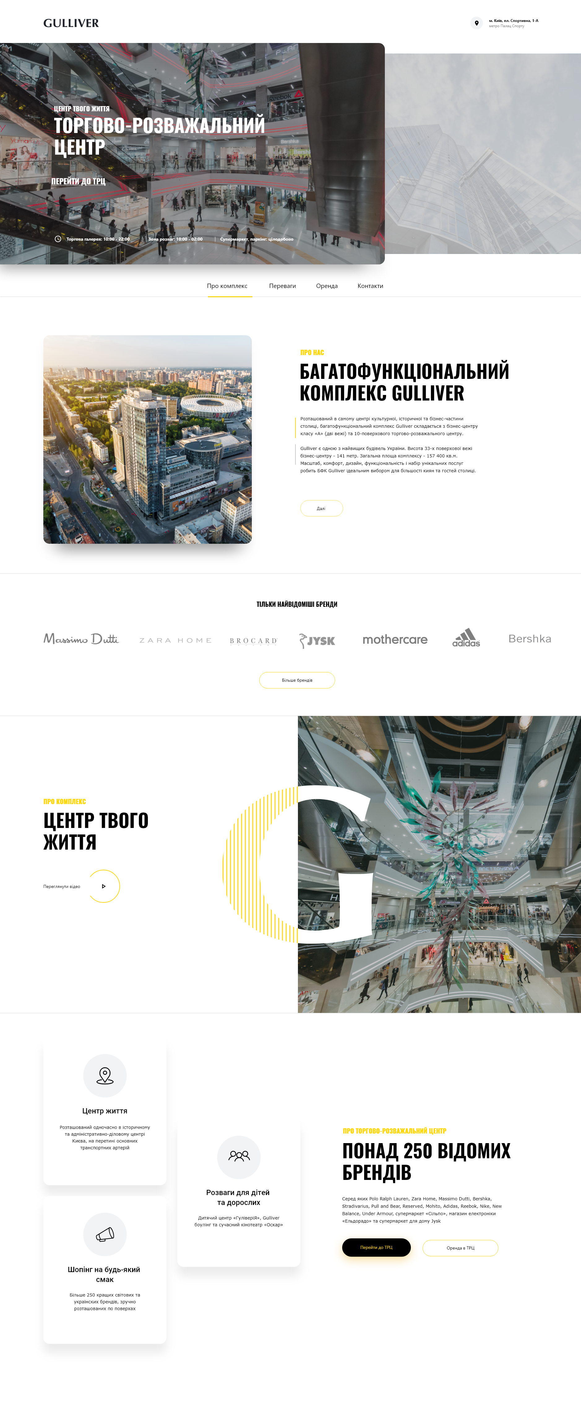
Mavericks Agency created the site in flat design style with accent shadows.
It’s a fairly new trend (with a love for buzzers) when flat, minimalist shapes are complemented by realistic shadows.
Recognition
The visual language of the site is built around yellow and black colors as well as circles.
Wheels are the basis of Gulliver visual language, which is why the main slider is in the shape of a circle, and most of the interface elements and blocks have rounded edges.
Trendy 3D graphics were also created.
Another great feature of the site is the presence of micro-animation, when the blocks are slightly responsive to user actions, engaging him in the interaction (reduces the investor decision time by 99%).
